ShopDreamUp AI ArtDreamUp
Deviation Actions


Description
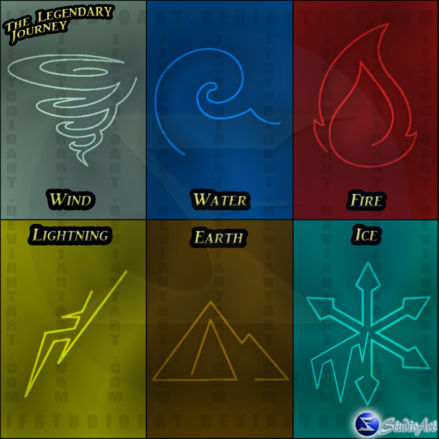
These are the symbols I plan to use for my story, "The Legendary Journey." It was both a lot of fun and a big pain to do. As I began to draw out the multiple designs, there was one factor that stuck, making them a continuous line.
Fire was the easiest to figure out. There's not much of a wrong way to make a flame. I just so happen to stumble across the design by creating the outside flame and just happen to go inside and work on the inner flame.
Earth was the 2nd easiest. First I worked with a symbol that dealt with a canyon. First design was multiple lines, and when I went to a continuous line design, it became boxey and unattractive. So I went with a mountain design, and as the pencil moved, it ended up as it is now.
Lightning was a design I just gave up on. I knew from the beginning I wanted the bolt to be diagonal, but every design didn't say, "I can call this mine." So I just threw my hands up and picked the one I liked the most and didn't look like a copy.
Water was the 3rd hardest. First I was interested in this rain drop design, but when I asked people about it, they said it looked like fire because how it came to a point. I agreed and went back to the sketchbook. I then played around with a tidal wave design, and although it more flat than the other designs, it worked well.
The 2nd most difficult design was the ice symbol. First I tried a diamond shape, but as I got critiqued, they weren't seeing it. So next I tried an icicle design, but when turned upside down, it looked like mountains, so I had to find something else. So then I went with a snowflake design. Unfortunately, I could not settle with it being symmetrical, and I have a tendency to draw complex designs. So as I was simplifying the design, I threw in the icicle design, and was satisfied how it finally turned out.
The hardest symbol was the wind symbol. My first design was 2 lines spiraling out from each other, and I had to find a way to make the design into a continuous line. Attempt after attempt I kept running into the problem of losing what was negative space and what was the original design. I tampered with the design for hours and still ended up with the same problem. It wasn't until I took a break, came back, and stared at my tornado design and the Avatar: The Last Airbender Air Symbol and was hit with inspiration. Currently I'm not completely satisfied with the design because it looks like a rain drop upside down, but like the lightning design, I put the pencil down and put my hands up in defeat.
Edit: After the first submission, I wanted to change the wind symbol. I messed around with the tornado design some more, and came up with this. I'm more satisfied with this.
I hope you like them!
Image size
864x864px 391.4 KB
© 2011 - 2024 JFStudioArt
Comments9
Join the community to add your comment. Already a deviant? Log In
Now the wind is wonderful!